Claim Reporting
 When: 2022-2023
 Team: 1 PO, 1 BA, 4 Engineers; (Architect & 3 Developers), 1 Designer, 2 researchers
 My Role: Sr. Product Designer
 Tools: Figma, Figjam, ADO
When: 2022-2023
Team: 1 PO, 1 BA, 4 Engineers; (Architect & 3 Developers), 1 Designer, 2 researchers
My Role: Sr. Product Designer
Tools: Figma, Figjam, ADO
FM - (formerly FM Global) a leading mutual insurance company specializing in property risk management and commercial property insurance. FM needed to modernize their software applications to improve efficiency, functionality, and alignment with current technological standards.
Clients lacked an accessible way to report losses, making smaller claims < $150k more efficient to pay out than to formally report, rendering the system unnecessary for less significant damages.
The goal was to provide clients with a quick, easy, and simple way to report losses and file claims, saving time for both clients and FM while improving claims efficiency.
*FNOL = First Notice of Loss
As a Senior Product Designer on this project, I was responsible for leading and executing the design process to deliver an intuitive and efficient solution for clients. My key contributions included
CONSTRAINTS: This feature prioritized delivering business value by optimizing workflows and enhancing client experience, with limited emphasis on extensive discovery and research during development. The streamlined approach focused on achieving quick, impactful results to support operational efficiency and decision-making.
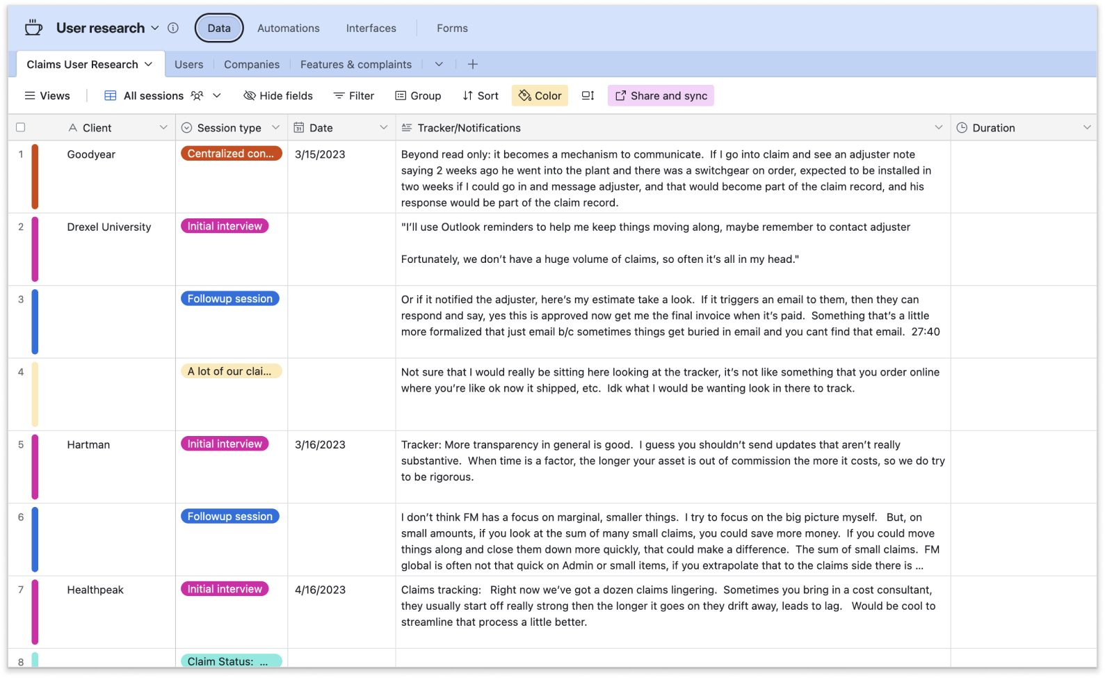
The research team interviewed users, clients, and brokers to identify pain points and needs, gaining insights into workflows and challenges. This informed the design process to enhance usability and streamline claims reporting. Their findings ensured the solution addressed user behaviors and expectations effectively.
Data from 18 participants revealed trends and challenges, guiding solutions. Centralizing the data ensured efficient collaboration and a user-centric approach.

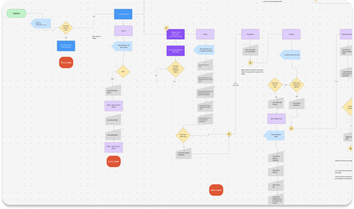
The design process for this aimed at creating a user-friendly simple, and easy experience. It began with mapping task flows in FigJam and collaborating with engineering to ensure technical feasibility and a smooth user journey. Low-fidelity prototypes were then created in Figma to visualize key interactions, such as selecting claim types, entering incident details, and uploading documents.
We used FigJam to map the user journey in more detail, addressing potential roadblocks. Collaboration with engineering ensured technical feasibility by considering constraints like database performance, allowing iterative adjustments to align the design with backend capabilities.
We created rough wireframes to map out the feature flow, providing a visual guide to the user journey. This process not only helped identify potential pitfalls early but also uncovered areas that might have been overlooked or missed, ensuring a more thorough and user-focused design approach.
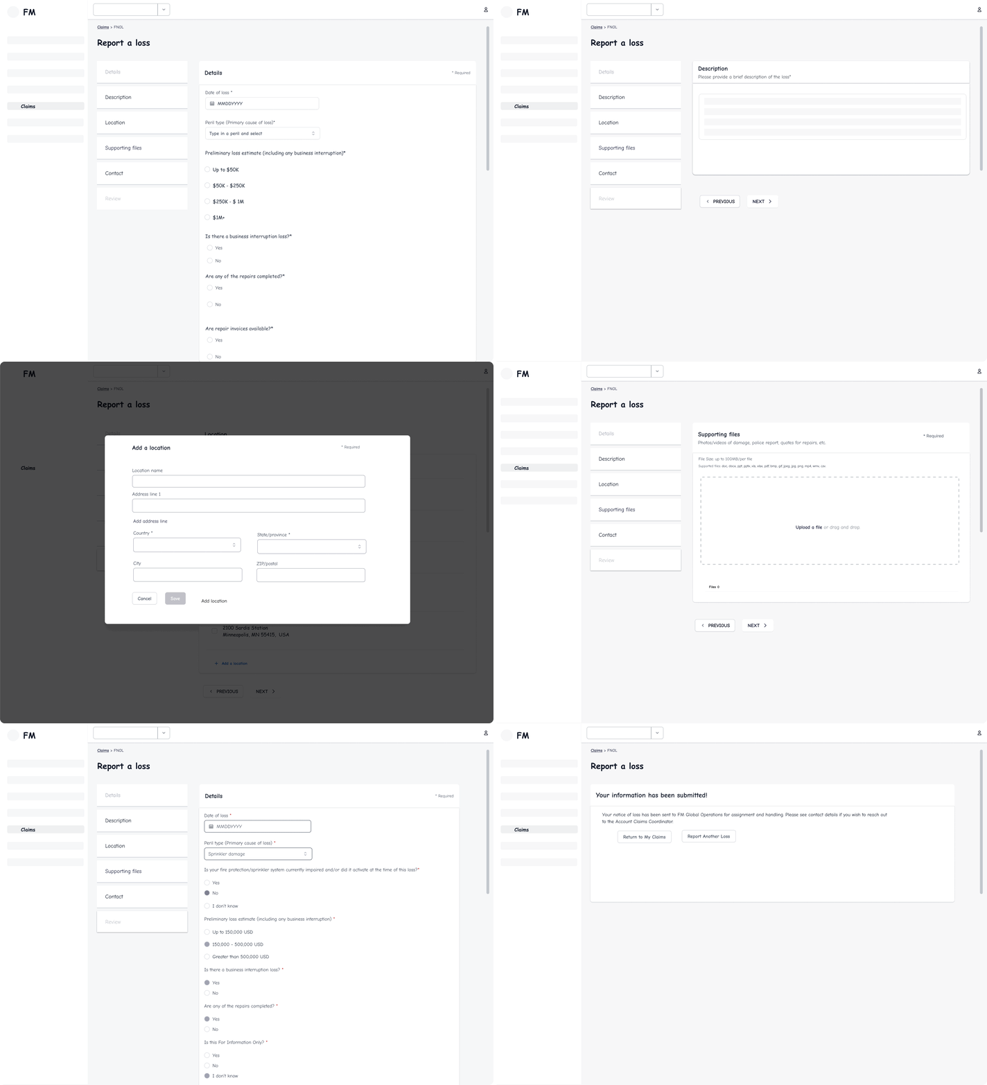
After the initial wireframes, we reviewed and identified changes, revisions, and potential challenges to address.
All fields in the form are required, with the exception of uploading documents or images. Error handling needed to be intuitive to minimize user frustration and provide clear guidance.
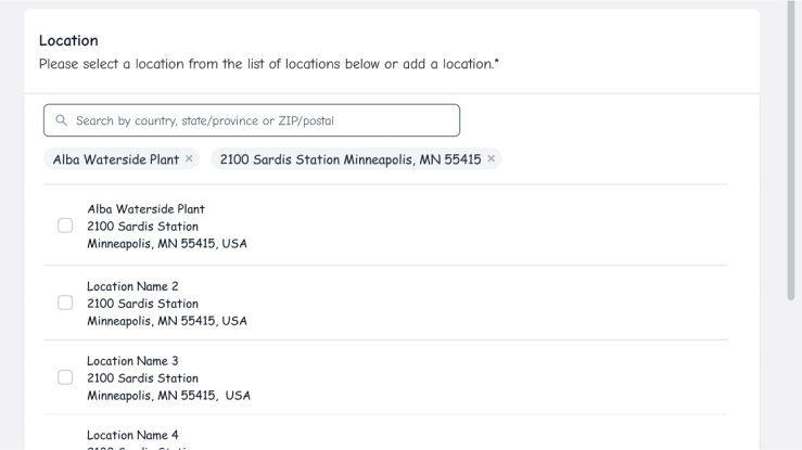
Location search was challenging; due to such a large query, we needed to give the user some kind of recourse (if it needed to be removed) if a selected location was deep into pagination.
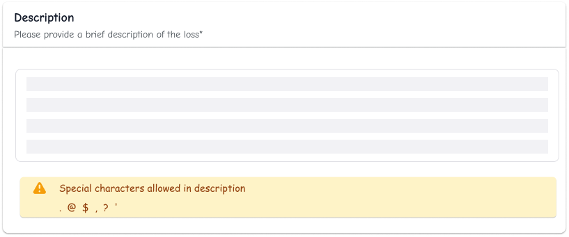
The technical constraints for the 'description' field limited users to a specific set of special characters, so we ensured this requirement was clearly communicated upfront.
 Sub Flows
The first sub-flow focused on document uploads, where users were able to attach files while getting clear feedback on acceptable file type, formats and sizes. We prioritized intuitive error handling upfront to make sure users could easily correct mistakes and smoothly return to the main flow without frustration.
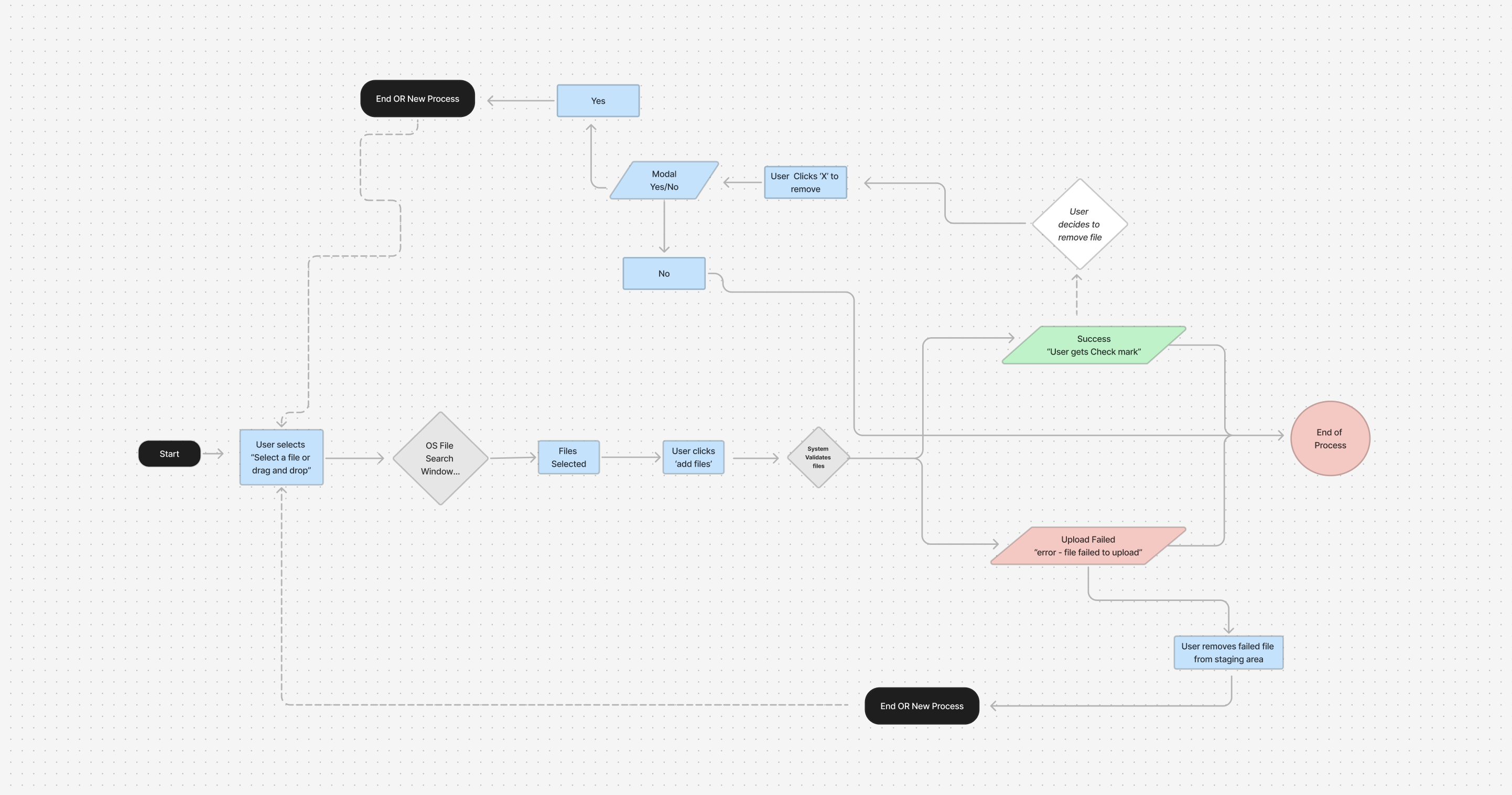
The file upload feature is a critical enhancement to the claims reporting process, built to prioritize speed and efficiency. It enables users to send all required documents and images in one action, significantly reducing their workload and simplifying the claims journey.
Users no longer need to upload files one by one, streamlining the process and allowing claims to be submitted and processed faster.
Consolidating multiple file submissions into one step makes the claims process more straightforward and user-friendly.
By automating and simplifying the upload process, this feature minimizes effort for users and claims teams, allowing everyone to focus on resolving claims efficiently.
The feature directly improves the speed of claim processing and reduces delays, making a noticeable difference in user satisfaction and operational productivity.
The second flow focused on adding a new location, initiated by selecting "Add Location" to open a modal form for entering details like name, address, and basic info. Upon submission, the location is saved, with confirmation or error messages, and users have the option to delete locations if necessary.
Including the ability to manually add a location to a claim was a vital enhancement for the product. Given the size and complexity of the database, which contains a vast number of addresses, it was easy for locations to be overlooked or mismanaged during the claims process. This feature ensures accuracy and efficiency in handling claims tied to specific locations.
While I saw opportunities to further refine certain aspects of the FNOL experience—particularly in areas like navigation/stepper and the editing process—some decisions ultimately rested with the product owner. My role was to advocate for user-centered solutions, provide research-backed recommendations, and collaborate within the given constraints. Although I didn’t have the authority to make final calls, I focused on influencing through insights, presenting alternatives, and ensuring the best possible experience within the defined scope.
After the launch, we received overwhelmingly positive feedback from users who were excited about the new FNOL system. The consensus was that the process was much easier and more intuitive. Key success indicators included:
External users (policyholders) found the FNOL system much easier to use while adjusters saw a reduction in overall process time.
Users completed claims faster with fewer errors, indicating an improvement in the overall claims submission process.
Early adoption was good, but we didn't do a lot of final testing, so further iterations could improve the experience even more
Internal teams praised the system’s alignment with business goals, and the company noted improvements in operational efficiency.
In conclusion, this project successfully delivered a streamlined and user-friendly FNOL (First Notice of Loss) system for reporting claims, improving the process for FM's clients. By combining user research, collaborative design iterations, and usability testing, we were able to create a solution that met both business objectives and user needs. This experience not only reinforced the importance of empathy in design but also underscored the value of collaborating with diverse teams to achieve a shared vision. The project continues to be a key example of how thoughtful, user-centered design can make a tangible impact in real-world applications.
